
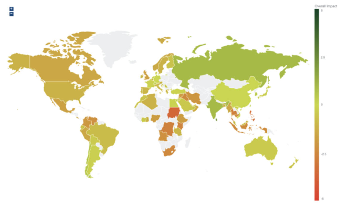
Do you know what this graph stands for? It is a heatmap about the economic impacts of the world’s coronavirus pandemic on March 4th, 2021.
Cool, right? You must be interested in the heatmap. What is it? And what does it do?
A heatmap is a two-dimensional visual representation of data using colors, where the colors all represent different values by hue or intensity. Heatmaps are helpful because they can provide an efficient and comprehensive overview of a topic at-a-glance. Unlike charts or tables, which have to be interpreted or studied to be understood, heatmaps are direct data visualization tools that are more self-explanatory and easier to read.
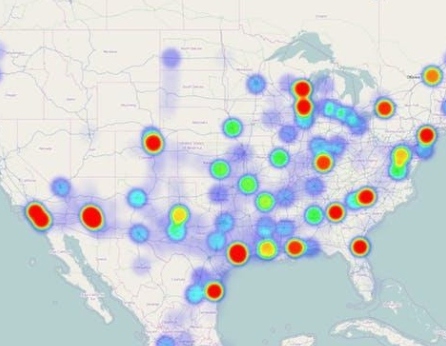
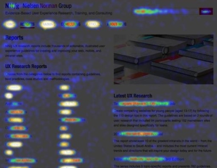
Heatmaps have applications in different fields, from Google maps showing how crowded it is to webpage analysis reflecting the number of hits a website receives.

You can imagine heatmaps are also applied in medical imaging to comprehend the area of interest that the neural network uses to make the decision. They use gradients from a pre-trained neural network to produce a coarse localization map highlighting the vital regions of the image for predicting the image’s classification. For example, the heatmap is used to detect the blood patterns in the hemophilia knee ultrasound images to help doctors diagnose hemarthrosis.
Now on to the fun part, using Heatmap in a sentence by the end of the day! (See rules here)
Serious: We use heatmaps to check whether the model is detecting the domain of interest.
Less serious: * On the road* “Which way should we go next?” “Right side! There are fewer people than the left side.” “How do you know?” “Heatmap said!”
… I’ll see you in the blogosphere.
Qianyu Fan