MiWORD of the Day Is… Heterogeneity!

Today we are going to talk about the variation within a dataset, which is different from the term “pure variance” that we commonly use. So, what exactly is heterogeneity? 

There are three different kinds of data heterogeneity within the dataset: clinical heterogeneity, methodological heterogeneity, and statistical heterogeneity. Inevitably, the observed individuals in a dataset will differ from each other, which from the perspective of medical imaging, a set of images might be different from the average pixel intensities, RGB values, border on the images, and so on. Therefore, any kind of variability within the dataset is likely to be termed heterogeneity. 

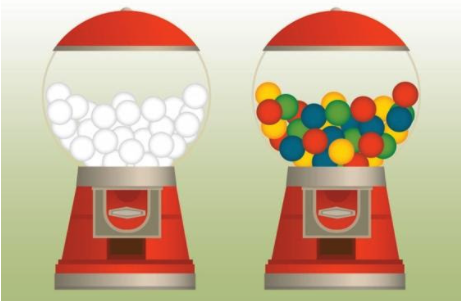
However, there are some differences between variance and heterogeneity. If a population has lots of variance, it only means that there are a lot of differences between the grand mean of the population and the individuals. Variance is a measure of dispersion, meaning how far a set of numbers is spread out from their average value. However, with respect to data heterogeneity, it means that there are several subpopulations in a dataset, and these subpopulations are disparate from each other. Therefore, we consider the between-group heterogeneity which represents the extent to which the measurements of each group vary within a dataset, considering the mean of each subgroup and the grand mean of the population. 

Chart, box and whisker chart

Description automatically generated
Chart, scatter chart

Description automatically generated

For example, if we are studying the height of a population, it is expected that the height of people from different regions (e.g., north, south, east, west of Canada) will be disparate from each other. If we separate the population into groups according to the region, we can calculate heterogeneity by measuring the variation of height between each group. If a population has a high value of heterogeneity, it will cause some problems to model training, causing a low testing accuracy.

Now for the fun part, using heterogeneity in a sentence by the end of the day!

Serious: The between-group heterogeneity in the training dataset made some negative impacts to the model training and therefore resulted in low testing accuracy.

Less serious: Today’s dinner was so wonderful! We had stewing beef, fried chicken, roasted lamb, and salads. There is so much heterogeneity in today’s dinner!

See you in the blogosphere!

Linxi Chen

MiWORD of the day is…logistic regression!

In a neuron, long, tree-like appendages called dendrites receive chemical signals – either excitatory or inhibitory – from many different surrounding neurons. If the net signal received in the neuron’s cell body exceeds a certain threshold, then the neuron fires and the electrochemical signal is transmitted onwards to other neurons. Sure, this process is fascinating, but what does it have to do with statistics and machine learning?

Well, it turns out that the way a neuron functions – taking a whole bunch of weighted inputs, aggregating them, and then outputting a binary response – is a good analogy for a method known as logistic regression. (In fact, Warren McCulloch and Walter Pitts proposed the “threshold logic unit” in 1943, an early computational representation of the neuron that works exactly like this!)

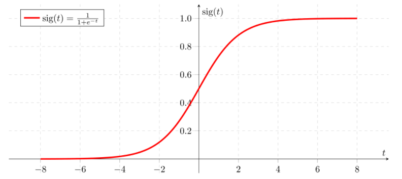
Perhaps you’ve heard of linear regression, which is used to model the relationship between a continuous scalar response variable and at least one explanatory variable. Linear regression works by fitting a linear equation to the data, or, in other words, finding a “line of best fit.” Logistic regression is similar, but it instead “squeezes” the output of a linear equation between 0 and 1 using a special sigmoid function. In other words, linear regression is used when the dependent variable is continuous, and logistic regression is used when the dependent variable is categorical.

Since the output of the sigmoid function is bounded between 0 and 1, it’s treated as a probability. If the sigmoid output for a particular input is greater than the classification threshold (for instance, 0.5), then the observation is classified into one category. If not, it’s classified into the other category. This ability to divide data points into one of two binary categories makes logistic regression very useful for classification problems.

Let’s say we want to predict whether a particular email is spam or not. We might have a dataset with explanatory variables like the number of typos in the email or the name of the sender. Once we fit a logistic regression model to this data, we can calculate “odds ratios” for each of the two explanatory variables. If we got an odds ratio of 2 for the variable representing the number of typos in the email, for example, we know that every additional typo doubles the estimated odds chance of the email being spam. Much like the coefficients in linear regression, odds ratios can give us a sense of a variable’s “importance” to the model.

Now let’s use “logistic regression” in a sentence.

Serious: I want to predict whether this tumour is benign or malignant based on several tissue characteristics. Let’s fit a logistic regression model to the data!

Less serious: 

Person 1: I built a neural network!

Person 2: Hey – that’s cheating! You only used a *single* neuron, so you’re basically just doing logistic regression…

See you in the blogosphere!

Jacqueline Seal

Today’s MiWORD of the day is … YOLO!

YOLO? You Only Live Once! Go and take adventures before we waste life in the common days, as in The Motto by Drake.

Well, maybe we should go back from the lecture hall of PCS100 (Popular Culture Study) to the classroom of computer science and statistics. In the world of algorithms, YOLO refers to You Only Look Once. Its name has indicated that it is very powerful with full confidence on its efficiency. But what is such a powerful algorithm and how does it work?

YOLO is an algorithm of bounding box regression that performs object detection. It can recognize the classes of objects in images and bound those objects with predicted boxes, where the tasks of classification and localization are completed at the same time. Compared with previous region-based algorithms like R-CNN, YOLO is more efficient because it is region-free.

Object detection methods usually use sliding windows to go through the whole image and see whether there is an object in each window. Region-based algorithms like R-CNN apply Region Proposal to reduce the number of windows to check. YOLO is different as it makes predictions on the entire image at the same time. As an analogy for fishing, R-CNN first divides the regions and picks those regions where fish might occur, while YOLO puts a fishing net and catch fishes together. YOLO divides the image into grids where each grid recognizes an object whose center is inside the grid by its bounding boxes. When several grids declare that an object occurs inside, non-maximal suppression is applied to only keep the grid with highest confidence. Thus, the combination of grid confidence and grid predicted bounding boxes could tell the final classification and localization of each object in the image. 

As the development of region-free algorithms, there have been several versions of YOLO. One practical and advanced version is YOLOv3, which is also the version that I put in my project. It is widely applied in many fields, including the popular auto-driving and … also medical imaging analysis! YOLOv3 is popular because of its efficiency and simple usage, which could save much time for any potential user.

Now we can go to the fun part! Using YOLO in a sentence by the end of the day (I put both serious and not together):

Manager: “Where is Kolbe? He was supposed to finish his task of detecting all the tumors in these CT images tonight! Had he already gone through all thousands of images during the past hour?”

Yvonne: “Well, he was pretty stressed about his workload and asked me if there is any quick method that can help. I said YOLO.”

Manager: “That sounds good. The current version has good performance in many fields, and I bet it could help. Wait, but where did he go? He should be training models right now.”

Yvonne: “No idea. He just got excited and shouted YOLO, turned off the computer and left quickly without any message. I guess he was humming like Tik Tok when phoning with his friends.”

Manager: “Okay, I can probably guess what happened. I need a talk with him tomorrow…”

See you in the blogosphere! 

Jihong Huang

MiWord of the Day Is… Heatmap!

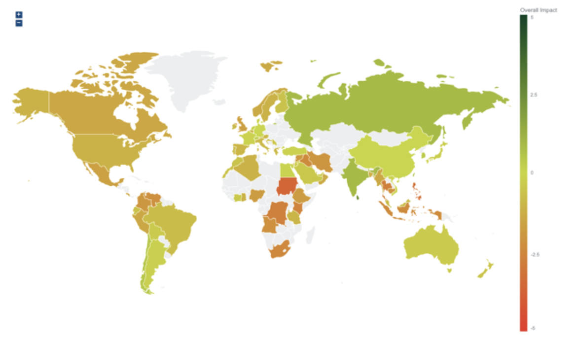
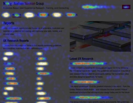
Do you know what this graph stands for? It is a heatmap about the economic impacts of the world’s coronavirus pandemic on March 4th, 2021. 

Cool, right? You must be interested in the heatmap. What is it? And what does it do? 

A heatmap is a two-dimensional visual representation of data using colors, where the colors all represent different values by hue or intensity. Heatmaps are helpful because they can provide an efficient and comprehensive overview of a topic at-a-glance. Unlike charts or tables, which have to be interpreted or studied to be understood, heatmaps are direct data visualization tools that are more self-explanatory and easier to read.

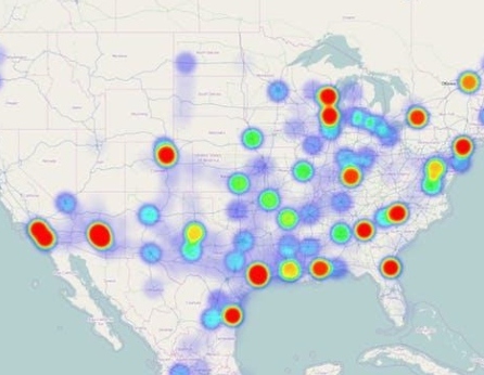
Heatmaps have applications in different fields, from Google maps showing how crowded it is to webpage analysis reflecting the number of hits a website receives. 

You can imagine heatmaps are also applied in medical imaging to comprehend the area of interest that the neural network uses to make the decision. They use gradients from a pre-trained neural network to produce a coarse localization map highlighting the vital regions of the image for predicting the image’s classification. For example, the heatmap is used to detect the blood patterns in the hemophilia knee ultrasound images to help doctors diagnose hemarthrosis.

Now on to the fun part, using Heatmap in a sentence by the end of the day! (See rules here)

Serious: We use heatmaps to check whether the model is detecting the domain of interest. 

Less serious: * On the road“Which way should we go next?” “Right side! There are fewer people than the left side.” “How do you know?” “Heatmap said!”

… I’ll see you in the blogosphere.

Qianyu Fan

MiWORD of the Day Is…Cosine Distance!

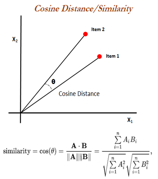
            Today we will talk about a way to measure distance, but not about how far away two objects are. Instead, cosine distance, or cosine similarity, is a measure of how similar two non-zero vectors are in terms of orientation, or to put it simply, the direction to which they point. Mathematically, the cosine similarity between two 2-D vectors is equal to the cosine of the angle between them, which can also be calculated using their dot product and magnitudes, as shown on the right. Two vectors pointing in the same direction will have a cosine similarity of 1; two vectors perpendicular to each other will have a similarity of 0; two vectors pointing in opposite direction will have a similarity of -1. Cosine distance is equal to (1 – cosine similarity). In this case, two vectors will have a cosine distance between 0 to 2: 0 when they are pointing in the same direction, and 2 when they are pointing in opposite direction. Cosine similarity and distance essentially measure the same thing, but the distance will convert any negative values to positive.

           Cosine distance and similarity also apply to higher dimensions, which makes them useful in analyzing images, texts, and other forms of data. In machine learning, we can use an algorithm to process a dataset of information and store each object as an array of multidimensional vectors, where each vector represents a feature. Then, we can use cosine similarity to compare how similar each pair of vectors are between the two objects and come up with an overall similarity score. In this case, two identical objects will have a similarity score of 1. In higher dimensions, we can rely on the computer to do the calculations for us. For example, we have the distance.cosine function in the SciPy package in Python will compute the cosine distance between two vector arrays in one go.

Here are two examples of how you can use cosine distance in a conversation:

Serious:  “I copied an entire essay for my assignment and this online plagiarizing checker says my similarity score is only 1! Time to hand it in.” “It says a COSINE similarity of 1. Please go back and write it yourself…”

Less serious: *during a police car chase* “Check how far are we from the suspect’s car!” “Well, assuming that he doesn’t turn, the distance between us will always be zero. Remember from your math class? Two vectors pointing in the same direction will always have a cosine distance of zero…”

… I’ll see you in the blogosphere.

Jenny Du

MiWord of the Day Is… Fourier Transform!

Ok, a what Transform now??

In the early 1800s, Jean-Baptiste Joseph Fourier, a French mathematician and physicist, introduced the transform in his study of heat transfer. The idea seemed preposterous to many mathematicians at the time, but it has now become an important cornerstone in mathematics.

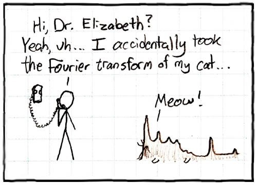
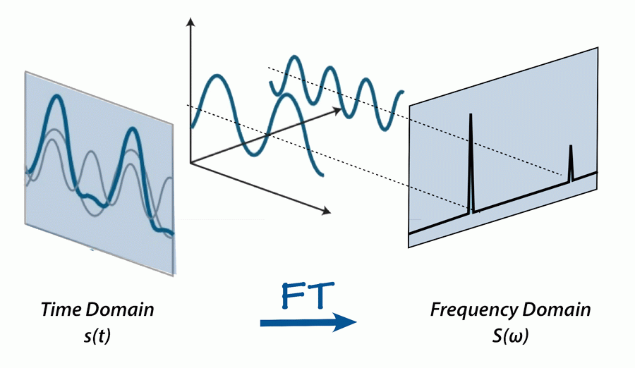
So, what exactly is the Fourier Transform? The Fourier Transform is a mathematical transform that decomposes a function into its sine and cosine components. It decomposes a function depending on space or time into a function depending on spatial or temporal frequency.

Before diving into the mathematical intricacies of the Fourier Transform, it is important to understand the intuition and the key idea behind it. The main idea of the Fourier Transform can be explained simply using the metaphor of creating a milkshake.

Imagine you have a milkshake. It is hard to look at a milkshake and understand it directly; answering questions such as “What gives this shake its nutty flavour?” or “What is the sugar content of this shake?” are harder to answer when we are simply given the milkshake. Instead, it is easier to answer these questions by understanding the recipe and the individual ingredients that make up the shake. So, how exactly does the Fourier Transform fit in here? Given a milkshake, the Fourier Transform allows us to find its recipe to determine how it was created; it is able to present the individual ingredients and the proportions at which they were combined to make the shake. This brings up the questions of how does the Fourier transform determine the milkshake “recipe” and why would we even use this transform to get the “recipe”? To answer the former question, we are able to determine the recipe of the milkshake by running it through filters that then extract each individual ingredient that makes up the shake. The reason we use the Fourier Transform to get the “recipe” is that recipes of milkshakes are much easier to analyze, compare, and modify than working with the actual milkshake itself. We can create new milkshakes by analyzing and modifying the recipe of an existing milkshake. Finally, after deconstructing the milkshake into its recipe and ingredients and analyzing them, we can simply blend the ingredients back to get the milkshake.

Extending this metaphor to signals, the Fourier Transform essentially takes a signal and finds the recipe that made it. It provides a specific viewpoint: “What if any signal could be represented as the sum of simple sine waves?”.

By providing a method to decompose a function into its sine and cosine components, we can analyze the function more easily and create modifications as needed for the task at hand.

 A common application of the Fourier Transform is in sound editing. If sound waves can be separated into their “ingredients” (i.e., the base and treble frequencies), we can modify this sound depending on our requirements. We can boost the frequencies we care about while hiding the frequencies that cause disturbances in the original sound. Similarly, there are many other applications of the Fourier Transform such as image compression, communication, and image restoration.

This is incredible! An idea that the mathematics community was skeptical of, now has applications to a variety of real-world applications.

Now, for the fun part, using Fourier Transform in a sentence by the end of the day:

Example 1:

Koby: “This 1000 puzzle is insanely difficult. How are we ever going to end up with the final puzzle picture?”

Eng: “Don’t worry! We can think of the puzzle pieces as being created by taking the ‘Fourier transform’ of the puzzle picture. All we have to do now is take the ‘inverse Fourier Transform’ and then we should be done!”

Koby: “Now when you put it that way…. Let’s do it!”

Example 2: 

Grace: “Hey Rohan! What’s the difference between a first-year and fourth-year computer science student?

Rohan: “… what?”

Grace: “A Fouri-y-e-a-r Transform”

Rohan: “…. (╯°□°)╯︵ ┻━┻ ”

I’ll see you in the blogosphere…

Parinita Edke

The MiDATA Word of the Day is…”clyster”

Holy mother of pearl! Do you remember when the first Pokémon games came out on the Game Boy? Never heard of Pokémon? Get up to speed by watching this short video. Or even better! Try out one of the games in the series, and let me know how that goes!

The name of the Pokémon in this picture is Cloyster. You may remember it from Pokémon Red or Blue. But! Cloyster, in fact, has nothing to do with clysters.

In olden days, clyster meant a bunch of persons, animals or things gathered in a close body. Now, it is better known as a cluster.

You yourself must identify with at least one group of people. What makes you human; your roles, qualities, or actions make you unique. But at the same time, you fall into a group of others with the same characteristics.

You yourself fall into multiple groups (or clusters). This could be your friend circle or perhaps people you connect with on a particular topic. At the end of the day, you belong to these groups. But is there a way we can determine that you, in fact, belong?

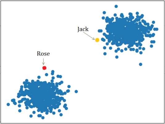
Take for example Jack and Rose from the Titanic. Did Jack and Rose belong together?

If you take a look at the plot to the right, Jack and Rose clearly do not belong together. They belong to two separate groups (clusters) of people. Thus, they do not belong together. Case closed!

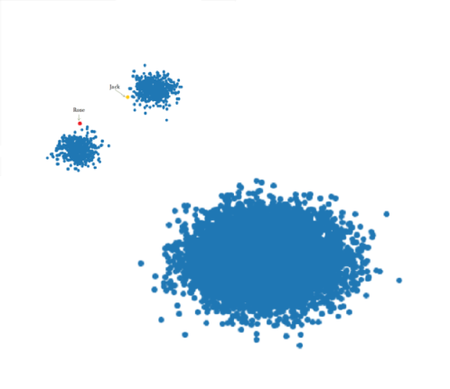
But perhaps it is a matter of perspective? Let’s take a step back…

Woah! Now, you could now say that they’re close enough, they might as well be together! Compared to the largest group, they are more similar than they are different. And so, they should be together!

For the last time, we may have been looking at this completely wrong! From the very beginning, what are we measuring on the x-axis and on the y-axis of our graph?

Say it was muscle mass and height. That alone shouldn’t tell us if Rose and Jack belong together! And yet, that is exactly what we could have done. But if not those, then what..?

Now for the fun part (see the rules here), using clyster in a sentence by the end of the day:

Serious: Did you see the huge star clysters last night? I heard each one contained anywhere from 10,000 to several million stars…

Less serious: *At a seafood restaurant by the beach* Excuse me, waiter! I’d like one of your freshest clysters, please. – “I’m sorry. We’re all out!”

…I’ll see you in the blogosphere.

Stanley Hua

Today’s MiWORD of the day is… Lasso!

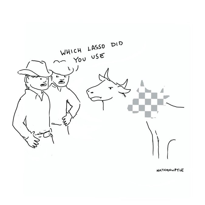
Wait… Lasso? Isn’t a lasso that lariat or loop-like rope that cowboys use? Or perhaps you may be thinking about that tool in Photoshop that’s used for selecting free-form segments!

Well… technically neither is wrong! However, in statistics and machine learning, Lasso stands for something completely different: least absolute shrinkage and selection operator. This term was coined by Dr. Robert Tibshirani in 1996 (who was a UofT professor at that time!).

Okay… that’s cool and all, but what the heck does that actually mean? And what does it do?

Lasso is a type of regression analysis method, meaning it tries to estimate the relationship between predictor variables and outcomes. It’s typically used to perform feature selection or regularization.

Regularization is a way of reducing overfitting of a model, ie. it removes some of the “noise” and randomness of the data. On the other hand, feature selection is a form of dimension reduction. Out of all the predictor variables in a dataset, it will select the few that contribute the most to the outcome variable to include in a predictive model.

Lasso works by applying a fixed upper bound to the sum of absolute values of the coefficient of the predictors in a model. To ensure that this sum is within the upper bound, the algorithm will shrink some of the coefficients, particularly it shrinks the coefficients of predictors that are less important to the outcome. The predictors whose coefficients are shrunk to zero are not included at all in the final predictive model.

Lasso has applications in a variety of different fields! It’s used in finance, economics, physics, mathematics, and if you haven’t guessed already… medical imaging! As the state-of-the-art feature selection technique, Lasso is used a lot in turning large radiomic datasets into easily interpretable predictive models that help researchers study, treat, and diagnose diseases.

Now onto the fun part, using Lasso in a sentence by the end of the day! (see rules here)

Serious: This predictive model I got using Lasso has amazing accuracy for detecting the presence of a tumour!

Less serious: I went to my professor’s office hours for some help on how to use Lasso, but out of nowhere he pulled out a rope!

See you in the blogosphere!

Jessica Xu

MiWord of the Day Is… dimensionality reduction!

Guess what?

You are looking at a real person, not a painting! This is one of the great works by a talented artist Alexa Meade, who paints on 3D objects but creates a 2D painting illusion. Similarly in the world of statistics and machine learning, dimensionality reduction means what it sounds like: reduce the problem to a lower dimension. But only this time, not an illusion.

Imagine a 1x1x1 data point living inside a 2x2x2 feature space. If I ask you to calculate the data density, you will get ½ for 1D, ¼ for 2D and 1/8 for 3D. This simple example illustrates that the data points become sparser in higher dimensional feature space. To address this problem, we need some dimensional reduction tools to eliminate the boring dimensions (dimensions that do not give much information on the characteristics of the data).

There are mainly two approaches when it comes to dimension reduction. One is to select a subset of features (feature selection), the other is to construct some new features to describe the data in fewer dimensions (feature extraction).

Let us consider an example to illustrate the difference. Suppose you are asked to come up features to predict the university acceptance rate of your local high school.

You may discard the “grade in middle school” for its many missing values; discard “date of birth” and “student name” as they are not playing much role in applying university; discard “weight > 50kg” as everyone has the same value; discard “grade in GPA” as it can be calculated. If you have been through a similar process, congratulations! You just performed a dimension reduction by feature selection.

What you have done is removing the features with many missing values, the least correlated features, the features with low variance and one of the highly correlated. The idea behind feature selection is that the data might contain some redundant or irrelevant features and can be removed without losing too much loss information.

Now, instead of selecting a subset of features, you might try to construct some new features from the old ones. For example, you might create a new feature named “school grade” based on the full history of the academic features. If you have been through a thought process like this, you just performed a dimensional reduction by feature extraction

If you would like to do a linear combination, principal component analysis (PCA) is the tool for you. In PCA, variables are linearly combined into a new set of variables, known as the principal components. One way to do so is to give a weighted linear combination of “grade in score”, “grade in middle school” and “recommend letter” …

Now let us use “dimensionality reduction” in a sentence.

Serious: There are too many features in this dataset, and the testing accuracy seems too low. Let us apply dimensional reduction techniques to reduce overfit of our model…

Less serious:

Mom: “How was your trip to Tokyo?”

Me: “Great! Let me just send you a dimensionality reduction version of Tokyo.”

Mom: “A what Tokyo?”

Me: “Well, I mean … photos of Tokyo.”

I’ll see you in the blogosphere…

Jacky Wang

MiVIP meets AI…

Well, I think it was inevitable. My data science lab has slowly crossed over to the dark side into the world of  Machine Learning and Artificial Intelligence.


Let me apologize for being MIA for so long. Life has been pretty hectic these past months as I have been building the MiDATA program here in the Department of Medical Imaging at the University of Toronto. The good news is that the MiVIP program will now be inviting students to participate in machine learning and artificial intelligence in medical image research.


This summer will include the launch our our MiStats+ML program where we will have students from the department of statistical sciences, computer sciences, and life sciences all work together on ML/AI projects in the MiDATA lab.


Stay tuned as we ramp up and get back to some our previous threads like MiWORD of the day…


See you in the blogosphere,


Pascal