MiWORD of the Day is… Attention!

In cognitive psychology, attention refers to the process of concentrating mental effort on sensory or mental events. When we attenuate to a certain object over others, our memory associated with that object is often better. Attention, according to William James, also involves “withdrawing from some things in order to effectively deal with others.” There are lots of things that are potential objects of our attention, but we attend to some things and ignore others. This ability helps our brain save processing resources by suppressing irrelevant features.

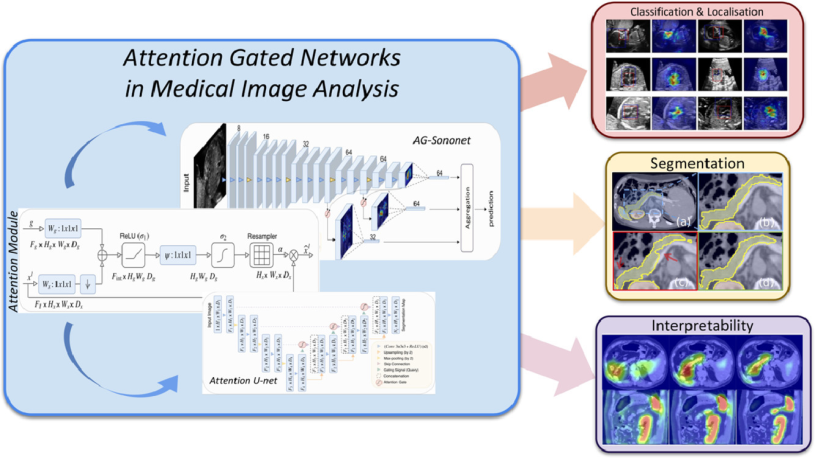
In image segmentation, attention is the process of highlighting the relevant activations during training. Attention gates can learn to focus on target features automatically through training. Then during testing, they can highlight salient information useful for a specific task. Therefore, just like when we allocate attention to specific tasks our performance would be improved, the attention gates would also improve model sensitivity and accuracy. In addition, models trained with attention gates also learn to suppress irrelevant regions as humans do; hence, reducing the computational resources used on irrelevant activations.

Now let’s use attention in a sentence by the end of the day!

Serious: With the introduction of attention gates in standard U-Net, the global information of the recess distention is obtained, and the irrelevant background noise is suppressed which in turn increases the model’s sensitivity and leads to smoother and more complete segmentation.

Less serious:
Will: That lady said I am a guy worth paying attention to (。≖ˇ∀ˇ≖。)
Nana: Sadly, she said that to the security guard…

Today’s MiWORD of the day is… Agreement!

You know that magical moment where you and your friend finally agree on a place to eat, or a movie to watch, and you wonder what lucky stars had to align to make that happen? When the chance of agreement was so small that you didn’t think you’d ever decide? If you wanted to capture how often you and your friend agree on a restaurant or a movie in such a way that accounted for whether it was due to random chance, Cohen’s Kappa is the choice for you.

Agreement can be calculated just by taking the number of agreed upon observations divided by the total observations; however, Jacob Cohen believed that wasn’t enough. As agreement was typically used for inter-rater reliability, Cohen argued that this measure didn’t account for the fact that sometimes, people just guess–especially if they are uncertain. In 1960, he proposed Cohen’s Kappa as a counter to traditional percent agreement, claiming his measure was more robust as it accounted for random chance agreement.

Cohen’s Kappa is used to calculate agreement between two raters–or in machine learning, it can be used to find the agreement between the prediction sets of two models. It is calculated by subtracting the probability of chance agreement from the probability of observed agreement, all over one minus the probability of chance agreement. Like many correlation metrics, it ranges from -1 to +1. A negative value of Cohen’s Kappa indicates that there is no relationship between the raters, or that they had a tendency to give different ratings. A Cohen’s Kappa of 0 indicates that there is no agreement between the predictors above what would be expected by chance. A Cohen’s Kappa of 1 indicates that the raters are in complete agreement.

As Cohen’s Kappa is calculated using frequencies, it can be unreliable in measuring agreement in situations where an outcome is rare. In such cases, it tends to be overly conservative and underestimates agreement on the rare category. Additionally, some statisticians disagree with the claim that Cohen’s Kappa accounts for random chance, as an explicit model of how chance affected decision making would be necessary to say this decisively. The chance adjustment of Kappa simply assumes that when raters are uncertain, they completely guess an outcome. However, this is highly unlikely in practice–usually people have some reason for their decision.

Let’s use this in a sentence, shall we?
Serious: The Cohen’s Kappa score between the two raters was 0.7. Therefore, there is substantial agreement between the raters’ observations.
Silly: A kappa of 0.7? They must always agree on a place to eat!

Today’s MiWORD of the day is… Artifact!

When the ancient Egyptians built the golden Mask of Tutankhamun or carved a simple message into the now infamous Rosetta Stone, they probably didn’t know that we’d be holding onto them centuries later, considering them incredible reflections of Egyptian history.

Both of these are among the most famous artifacts existing today in museums. An artifact is a man-made object that’s considered to be of high historical significance. However, in radiology, an artifact is a lot less desirable – it refers to parts of an image that appear differently and inaccurately reflect the body structures they are taken of.

Artifacts in radiography can happen to any image. For instance, they can occur from improper handling of machines used to take medical scans, patient movement during imaging, external objects (i.e. jewelry, buttons) and other unwanted occurrences.

Why are artifacts so important? They can lead to misdiagnoses that could be detrimental to a patient. Consider a hypothetical scenario where a patient goes in for imaging for a tumor. The radiologist identifies the tumor as benign, but in reality, due to mishandling of a machine, an image artifact exists on the image that hides the fact that it is in fact malignant. The outcome would be catastrophic in this case!

Of course, this kind of diagnosis is highly unlikely (especially with modern day medical imaging) and there a ton of factors at play with diagnosis. A real diagnosis, especially nowadays, would not be so simple (or we would be wrong not to severely lament the state of medicine today). However, even if artifacts don’t cause a misdiagnosis, they can pose obstacles to both radiologists and researchers working with these images.

One such area of research is the application of machine learning into the field of medical imaging. Whether we’re using convolutional neural networks or vision transformers, all of these machine learning models rely on images produced in some facility. The quality of these images, including the presence and frequency of artifacts, can affect the outcome of any experiments conducted with them. For instance, imagine you build a machine learning model to classify between two different types of ultrasound scans. The performance of the model is certainly a main factor – but the concern that the model might be focusing on artifacts within the image rather than structures of interest would also be a huge consideration.

In any case, the presence of artifacts (whether in medical imaging or in historical museums) certainly gives us a lot more to think about!

Now onto the fun part, using artifact in a sentence by the end of the day:

Serious: My convolutional neural network could possibly be focusing on artifacts resulting from machine handling in the ultrasound images during classification rather than actual body structures of interest. That would be terrible.

Less serious: The Rosetta Stone – a phenomenal, historically significant, hugely investigated Egyptian artifact that happened to be a slab of stone on which I have no idea what was inscribed.

I’ll see you in the blogosphere!

Jeffrey Huang

MiWORD of the day is…Compression!

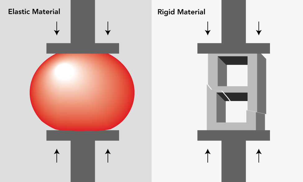
In physics, compression means that inward forces are evenly applied to an object from different directions. During this process, the atoms in the object change their position. After the forces are removed, the object may be restored depending on the type of materials it is made of. For example, when compression is applied to an elastic material such as a rubber ball, the air molecules inside the ball are compressed with decreased volume. After the compression force is removed, it quickly restores to its original sphere shape. On the other hand, when a compression force is applied to the brick, the solid clay cannot be compressed. Therefore, the compressive forces concentrate on the weakest point, causing the block to break at the middle point.

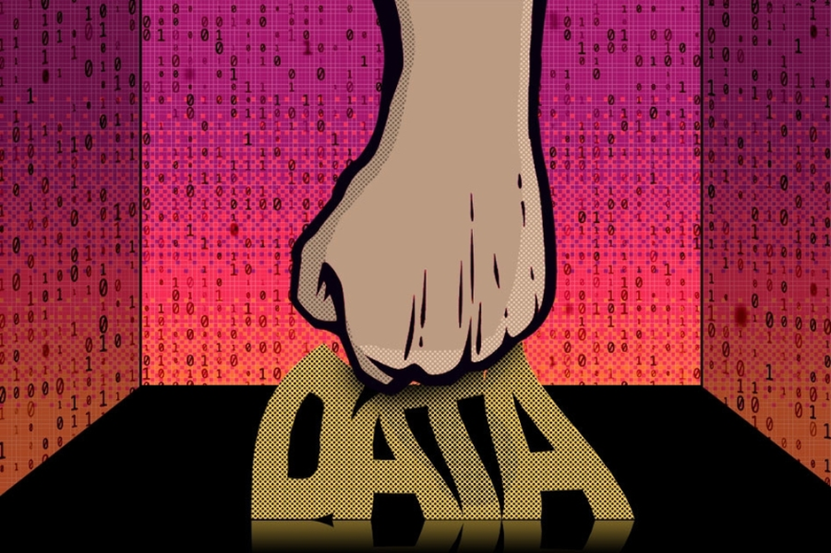
For images, compression is the process of encoding digital image information by using a specific encoding scheme. After compression, the image will have a smaller size. An image can be compressed because of the degree of redundancy. Since the neighboring pixels of an image are correlated, the information may be considered redundant among the neighboring pixels. During compression, these redundant pixel values (i.e., values close to zero when encoding digital image information) are removed by comparing with the neighboring pixels. The higher the ratio is, the more the small values are removed. The image after compression uses fewer bits than the original unencoded representation, therefore, achieving size reduction purposes.

In the area of medical imaging, there are two different methods of compression that are commonly used, JPEG and JPEG2000. JPEG2000 is a new image coding system that compresses images based on the two-dimensional discrete wavelet transform (WDT). Unlike JPEG compression which decomposes the image based on the frequency content, JPEG decomposes image signals based on scale or resolution. It performs better than JPEG with much better image quality at moderate compression ratios. However, JPEG2000 does not perform well at a high compression ratio with the image appearing blurred.

Now onto the fun part, using compression in a sentence by the end of the day!

Serious: This high compression ratio has caused so much information loss that I cannot even recognize that it is a dog.

Less serious:

Tong: I could do compression with my eyes.

Grace: Really? How?

Tong: It is simple. Just remove the eyeglasses. Everything becomes compressed.

See you in the blogosphere!

Tong Su

MiWORD of the day is…Transformers and “The Age of Extinction” of CNNs?

Having had studied Machine Learning and Neural Networks for a long time, I no longer think of the movie when I hear the word “transformers”. Now, when I hear CNN, I no longer think of the news channel. So, I had a confusing conversation with my Social Sciences friend, when she said that CNN was biased, and I asked if her dataset was imbalanced. Nevertheless, why are we talking about this?

Before I learned about Neural Networks, I always wondered as to how computers could even “look” at images, let alone, tell us something about that image. Then, I learned about Convolutional Neural Networks, or CNNs! They work by sliding a small “window” across an image, while trying to make sense of the pixels that the window sees. As the CNN trains on images, it learns how to pick out edges and shapes that help it make sense of images down the line. For almost a decade, the best performing image models relied on convolutions. They are designed to do very well with images due to their “inductive bias” or “expertise” on images. These sliding window operations make it suitable to detect patterns in images.

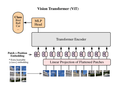
Transformers, on the other hand, were designed to work well with sequences of words. They take in a sequence of encoded words and can perform various tasks with them, such as language translation, sentiment analysis etc. However, they are so versatile that, in 2020, they were shown to outperform CNNs on image tasks. How the heck does a model designed for text even work with images you might ask! Well, you might have heard of the saying, “an image is worth a 1000 words.” But in 2020, Dosovitskiy et al. said “An image is worth 16×16 words”. In this paper, they cut up an image into patches of 16×16 pixels. Pixels from each patch were then fed into a transformer model as if each patch were a word from a text. On training this model on millions of images, it was found that it outperformed CNNs, even though it does not have that inductive bias! Essentially, it learns to look at images by looking at a lot of images.

Now, just like the Transformers franchise, a new paper on different flavors of vision transformers drops every year. And just as the movies in the franchise take a lot of money to make, transformers take a lot of data to train. However, once pretrained on enough data, they can smash CNNs out the park when further finetuned on small datasets like those common in medical imaging. 

Now let’s use transformers in a sentence…

Serious: My pretrained vision transformer finetuned to detect infiltration in these chest X-Ray images, outperformed the CNN.

Less Serious: I have 100,000 images, that’s enough data to train my Vision Transformer from scratch! *Famous last words*

See you in the blogosphere!

Manav Shah

The MiDATA Word of the Day is… “AP”

AP? Average Precision! What is it? And how is it useful?

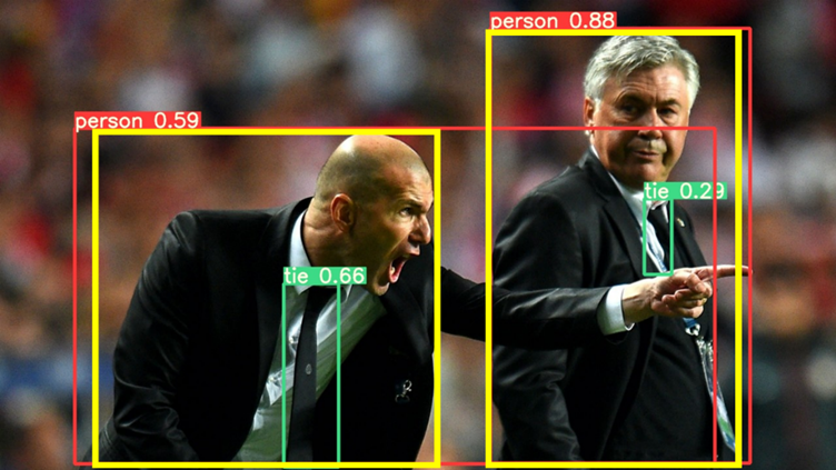
Imagine you are given a prediction model that can identify common objects, and you want to know how well the model performs. So you prepare a picture that contains 2 people, and labels them with bounding boxes in yellow yourself. Then you applied the model on this image, and the model boxes the people in red with different confidence scores. Not bad right? But how can you tell if this prediction is correct?

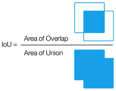
That’s where Intersection of Union (IoU) comes in, the first stop on our journey to AP. Looking at the boxes in the picture, you can see some parts of yellow box and red box overlap. IoU is the proprotion of their overlapping region over the union. For example, the prediction for the person on the left will have smaller IoU than the prediction for the other person.

If we set the cutoff the IoU to be 0.8, then the prediction on the left will be classified as false positive (FP) since it does not reach the threshold, whereas the prediction on the right will be true positive (TP).

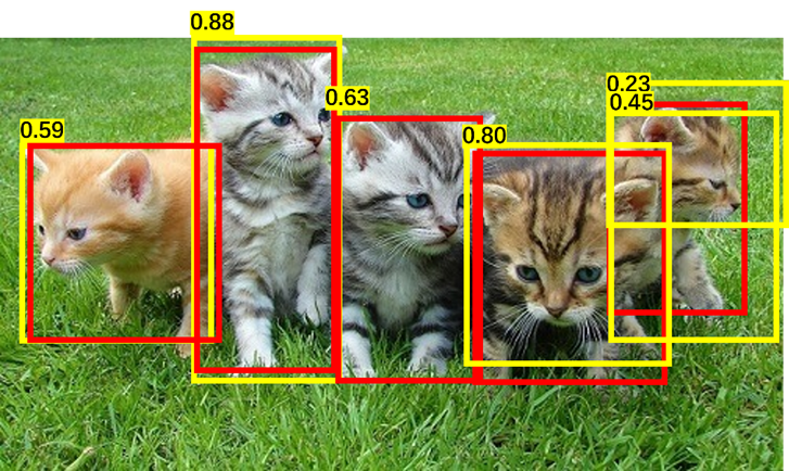
Now final piece before calculating AP. In this image of cats, we labeled 5 cats in red, and predictions are made in yellow. We rank the predictions on descending confidence score, and calculate the precision and recall. Precision is the proportion of TP out of all predictions, and Recall is the proportion of TP out of all ground-truth.

Here is a summary of calculations.

Rank of predictionsCorrect (Y/N)PrecisionRecall
1T10.2
2T10.4
3F0.670.4
4T0.750.6
5T0.80.8
6F0.670.8

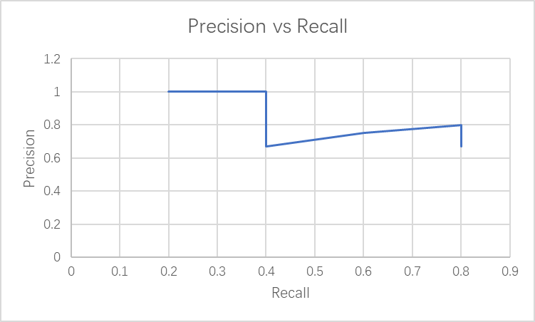
Then we plotted the precicion over recall curve.

Generally as recall increases, the precision decreases. AP is the area under the precision-recall curve! It is from 0 to 1, the higher the better.

Whoa! That’s a complicated definition. Often AP can be calculated directly by the model. Next time you see AP, you know it represents how good your model is.

Now for the fun part, using AP in a sentence by the end of the day:

Serious: AP is a measurement of accuracy in object detection model.

Less serious:

Child: Hey mom! I need some help with the assignment in boxing all the cars on the road.

Mother: Try this model! It has AP of 0.8, and it may be better at this than I do.

…I’ll see you in the blogosphere.

Grace Yu

MiWORD of the Day Is… Heterogeneity!

Today we are going to talk about the variation within a dataset, which is different from the term “pure variance” that we commonly use. So, what exactly is heterogeneity? 

There are three different kinds of data heterogeneity within the dataset: clinical heterogeneity, methodological heterogeneity, and statistical heterogeneity. Inevitably, the observed individuals in a dataset will differ from each other, which from the perspective of medical imaging, a set of images might be different from the average pixel intensities, RGB values, border on the images, and so on. Therefore, any kind of variability within the dataset is likely to be termed heterogeneity. 

However, there are some differences between variance and heterogeneity. If a population has lots of variance, it only means that there are a lot of differences between the grand mean of the population and the individuals. Variance is a measure of dispersion, meaning how far a set of numbers is spread out from their average value. However, with respect to data heterogeneity, it means that there are several subpopulations in a dataset, and these subpopulations are disparate from each other. Therefore, we consider the between-group heterogeneity which represents the extent to which the measurements of each group vary within a dataset, considering the mean of each subgroup and the grand mean of the population. 

Chart, box and whisker chart

Description automatically generated
Chart, scatter chart

Description automatically generated

For example, if we are studying the height of a population, it is expected that the height of people from different regions (e.g., north, south, east, west of Canada) will be disparate from each other. If we separate the population into groups according to the region, we can calculate heterogeneity by measuring the variation of height between each group. If a population has a high value of heterogeneity, it will cause some problems to model training, causing a low testing accuracy.

Now for the fun part, using heterogeneity in a sentence by the end of the day!

Serious: The between-group heterogeneity in the training dataset made some negative impacts to the model training and therefore resulted in low testing accuracy.

Less serious: Today’s dinner was so wonderful! We had stewing beef, fried chicken, roasted lamb, and salads. There is so much heterogeneity in today’s dinner!

See you in the blogosphere!

Linxi Chen

MiWORD of the day is…logistic regression!

In a neuron, long, tree-like appendages called dendrites receive chemical signals – either excitatory or inhibitory – from many different surrounding neurons. If the net signal received in the neuron’s cell body exceeds a certain threshold, then the neuron fires and the electrochemical signal is transmitted onwards to other neurons. Sure, this process is fascinating, but what does it have to do with statistics and machine learning?

Well, it turns out that the way a neuron functions – taking a whole bunch of weighted inputs, aggregating them, and then outputting a binary response – is a good analogy for a method known as logistic regression. (In fact, Warren McCulloch and Walter Pitts proposed the “threshold logic unit” in 1943, an early computational representation of the neuron that works exactly like this!)

Perhaps you’ve heard of linear regression, which is used to model the relationship between a continuous scalar response variable and at least one explanatory variable. Linear regression works by fitting a linear equation to the data, or, in other words, finding a “line of best fit.” Logistic regression is similar, but it instead “squeezes” the output of a linear equation between 0 and 1 using a special sigmoid function. In other words, linear regression is used when the dependent variable is continuous, and logistic regression is used when the dependent variable is categorical.

Since the output of the sigmoid function is bounded between 0 and 1, it’s treated as a probability. If the sigmoid output for a particular input is greater than the classification threshold (for instance, 0.5), then the observation is classified into one category. If not, it’s classified into the other category. This ability to divide data points into one of two binary categories makes logistic regression very useful for classification problems.

Let’s say we want to predict whether a particular email is spam or not. We might have a dataset with explanatory variables like the number of typos in the email or the name of the sender. Once we fit a logistic regression model to this data, we can calculate “odds ratios” for each of the two explanatory variables. If we got an odds ratio of 2 for the variable representing the number of typos in the email, for example, we know that every additional typo doubles the estimated odds chance of the email being spam. Much like the coefficients in linear regression, odds ratios can give us a sense of a variable’s “importance” to the model.

Now let’s use “logistic regression” in a sentence.

Serious: I want to predict whether this tumour is benign or malignant based on several tissue characteristics. Let’s fit a logistic regression model to the data!

Less serious: 

Person 1: I built a neural network!

Person 2: Hey – that’s cheating! You only used a *single* neuron, so you’re basically just doing logistic regression…

See you in the blogosphere!

Jacqueline Seal

Today’s MiWORD of the day is … YOLO!

YOLO? You Only Live Once! Go and take adventures before we waste life in the common days, as in The Motto by Drake.

Well, maybe we should go back from the lecture hall of PCS100 (Popular Culture Study) to the classroom of computer science and statistics. In the world of algorithms, YOLO refers to You Only Look Once. Its name has indicated that it is very powerful with full confidence on its efficiency. But what is such a powerful algorithm and how does it work?

YOLO is an algorithm of bounding box regression that performs object detection. It can recognize the classes of objects in images and bound those objects with predicted boxes, where the tasks of classification and localization are completed at the same time. Compared with previous region-based algorithms like R-CNN, YOLO is more efficient because it is region-free.

Object detection methods usually use sliding windows to go through the whole image and see whether there is an object in each window. Region-based algorithms like R-CNN apply Region Proposal to reduce the number of windows to check. YOLO is different as it makes predictions on the entire image at the same time. As an analogy for fishing, R-CNN first divides the regions and picks those regions where fish might occur, while YOLO puts a fishing net and catch fishes together. YOLO divides the image into grids where each grid recognizes an object whose center is inside the grid by its bounding boxes. When several grids declare that an object occurs inside, non-maximal suppression is applied to only keep the grid with highest confidence. Thus, the combination of grid confidence and grid predicted bounding boxes could tell the final classification and localization of each object in the image. 

As the development of region-free algorithms, there have been several versions of YOLO. One practical and advanced version is YOLOv3, which is also the version that I put in my project. It is widely applied in many fields, including the popular auto-driving and … also medical imaging analysis! YOLOv3 is popular because of its efficiency and simple usage, which could save much time for any potential user.

Now we can go to the fun part! Using YOLO in a sentence by the end of the day (I put both serious and not together):

Manager: “Where is Kolbe? He was supposed to finish his task of detecting all the tumors in these CT images tonight! Had he already gone through all thousands of images during the past hour?”

Yvonne: “Well, he was pretty stressed about his workload and asked me if there is any quick method that can help. I said YOLO.”

Manager: “That sounds good. The current version has good performance in many fields, and I bet it could help. Wait, but where did he go? He should be training models right now.”

Yvonne: “No idea. He just got excited and shouted YOLO, turned off the computer and left quickly without any message. I guess he was humming like Tik Tok when phoning with his friends.”

Manager: “Okay, I can probably guess what happened. I need a talk with him tomorrow…”

See you in the blogosphere! 

Jihong Huang

MiWord of the Day Is… Heatmap!

Do you know what this graph stands for? It is a heatmap about the economic impacts of the world’s coronavirus pandemic on March 4th, 2021. 

Cool, right? You must be interested in the heatmap. What is it? And what does it do? 

A heatmap is a two-dimensional visual representation of data using colors, where the colors all represent different values by hue or intensity. Heatmaps are helpful because they can provide an efficient and comprehensive overview of a topic at-a-glance. Unlike charts or tables, which have to be interpreted or studied to be understood, heatmaps are direct data visualization tools that are more self-explanatory and easier to read.

Heatmaps have applications in different fields, from Google maps showing how crowded it is to webpage analysis reflecting the number of hits a website receives. 

You can imagine heatmaps are also applied in medical imaging to comprehend the area of interest that the neural network uses to make the decision. They use gradients from a pre-trained neural network to produce a coarse localization map highlighting the vital regions of the image for predicting the image’s classification. For example, the heatmap is used to detect the blood patterns in the hemophilia knee ultrasound images to help doctors diagnose hemarthrosis.

Now on to the fun part, using Heatmap in a sentence by the end of the day! (See rules here)

Serious: We use heatmaps to check whether the model is detecting the domain of interest. 

Less serious: * On the road“Which way should we go next?” “Right side! There are fewer people than the left side.” “How do you know?” “Heatmap said!”

… I’ll see you in the blogosphere.

Qianyu Fan